ESRTV
This case study explores the design process of a 24/7 streaming channel, ESR TV and the move to online streaming. Think Twitch vs Netflix.
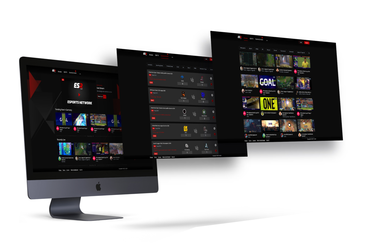
Project Overview
ESR is America's #1 award-nominated Gaming channel is packed with gaming entertainment essentials. Live gaming tournaments, docu-series, talk shows, comedies and user-generated content from the biggest names in e-sports.
The Problem
The challenge was to take a 24/7 American e-sports TV channel, and turn it into an interactive streaming WebApp, to launch in the Middle East, Germany and Spain. The goal was to create a visually stunning and user-friendly interface that caters to the needs of both casual viewers and hardcore gamers.
The application should provide users with the ability to personalise their viewing experience by selecting favourite teams, players, and game genres.
Goals
- Grow ESR brand by acquiring 100,000 new subscribers
- Integrate live scores of tournaments events
- Personalised streaming platform
- Interactive environment
My Role
UI/UX Design
Frontend Developer
Tools
Figma
Miro
Jira
Timeline
Overall: 4 months
Process
User Stories User Flows
Wireframes
HiFis
Style Guide
Frontend Development
Testing
Reflections
Research
Our research highlighted the need to balance the platform's appeal between highly engaged hardcore gamers and casual gaming enthusiasts. With numerous live streams and events happening simultaneously, clear and organised presentation was key to avoiding user overwhelm. This insight led us to focus our initial launch on regions with the highest potential for user acquisition: the United Arab Emirates (UAE), Spain, and Germany.
Ideation
Leveraging our research, we created wireframes to define the information architecture and layout of key screens, followed by low-fidelity prototypes to test user flows. This iterative design process allowed us to refine the user experience, ensuring it met the needs of both target audiences. Key features included content categorisation, advanced search and filtering options, and personalised recommendations—all designed to drive user engagement and satisfaction.
User Stories
There had been required user stories submitted by the client. These involved basic functions. We developed on these further which lead to our foundation.
- As a user, I want to be able to subscribe and get access to the service easily.
- As a user, I want to be able to see upcoming, past and live event scores.
- As a user, I want to be able to easily search and filter through videos to see what I like.
- As a user, I want to be served personalised content that's relevant to me.
- As a user, I want to be able to follow my favourite gamers and see their profile.
User Flows
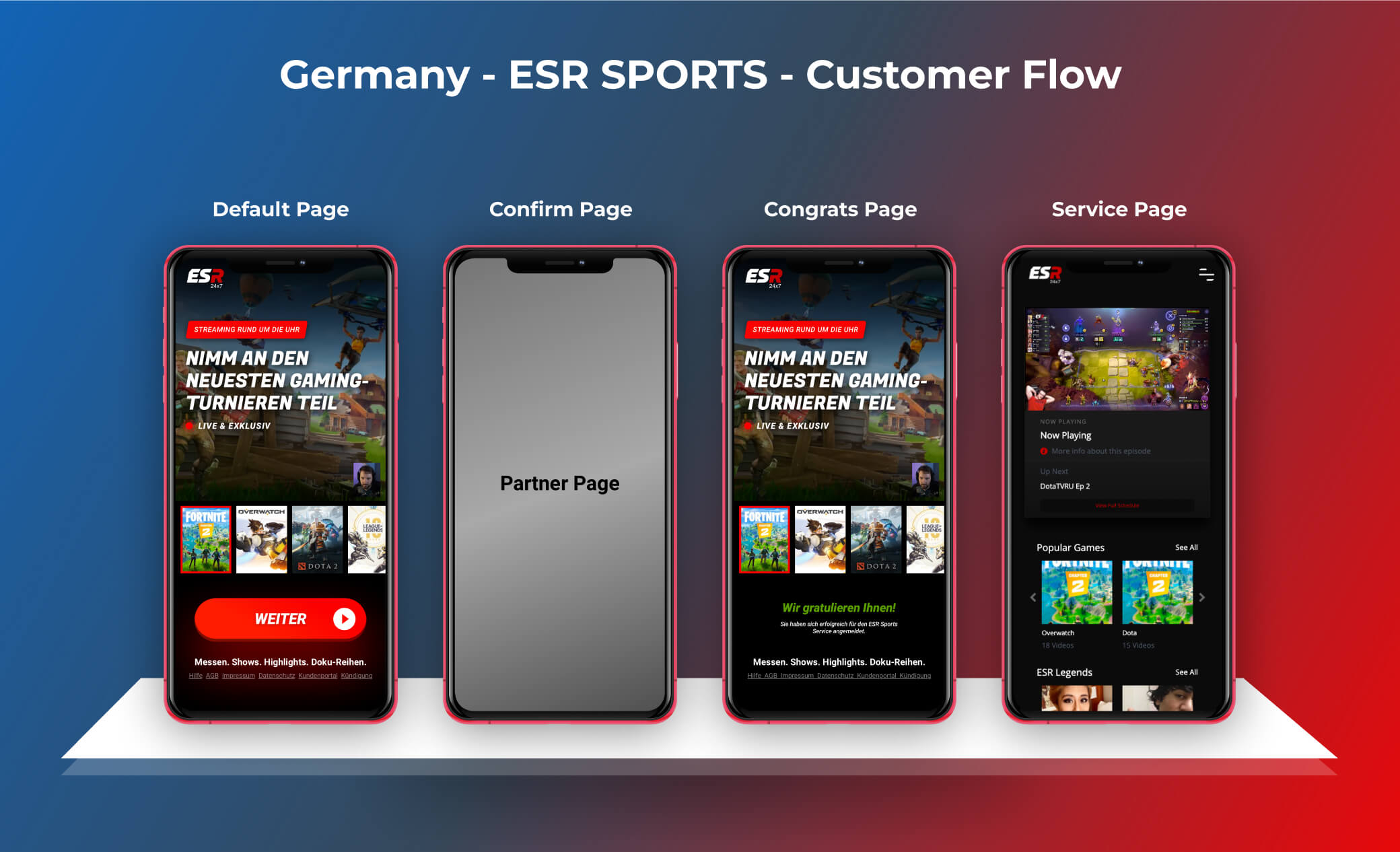
As this product was being launched across multiple countries, there was a complexity in how the subscriptions worked meaning the user would be sent to their telecommunications partner page in order to subscribe.
Design
Wireframes
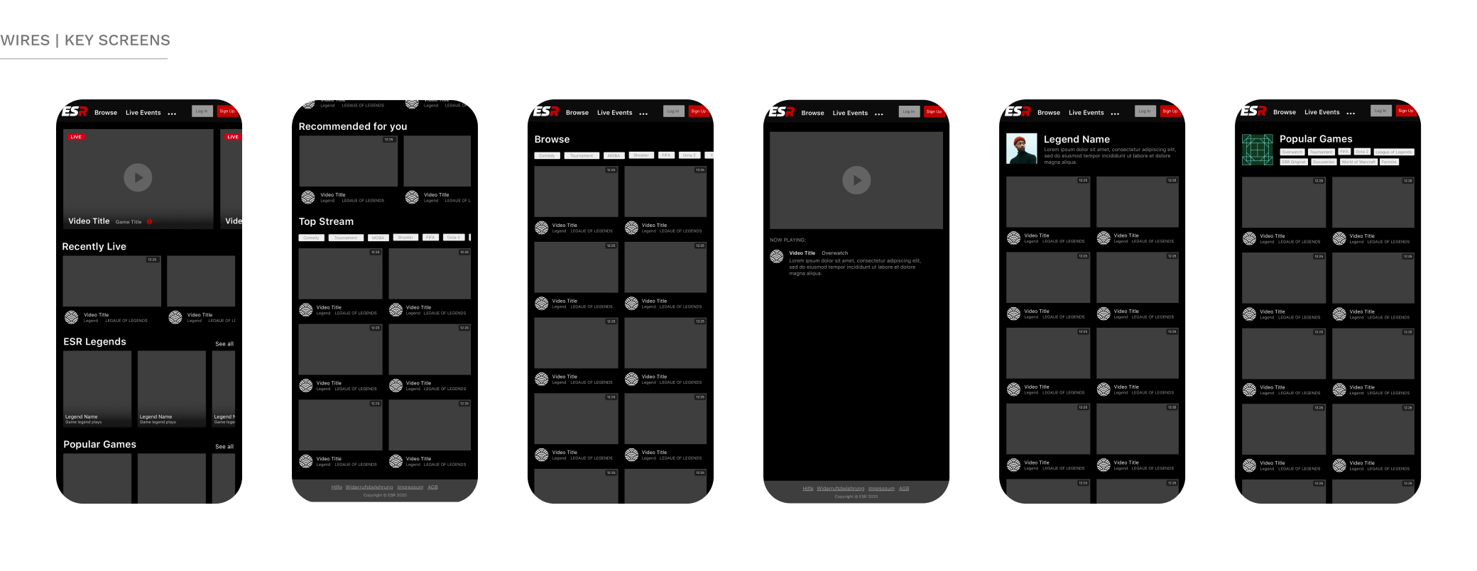
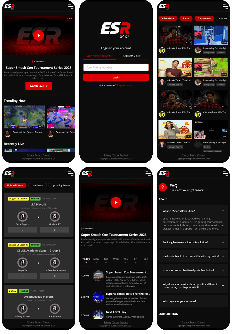
Since this application was a responsive design, we designed screens for mobile first before starting on the desktop version. Working alongside the design lead, we designed the initial round of wireframes and iterated upon these until we presented to the client and wider management team.
UI Design
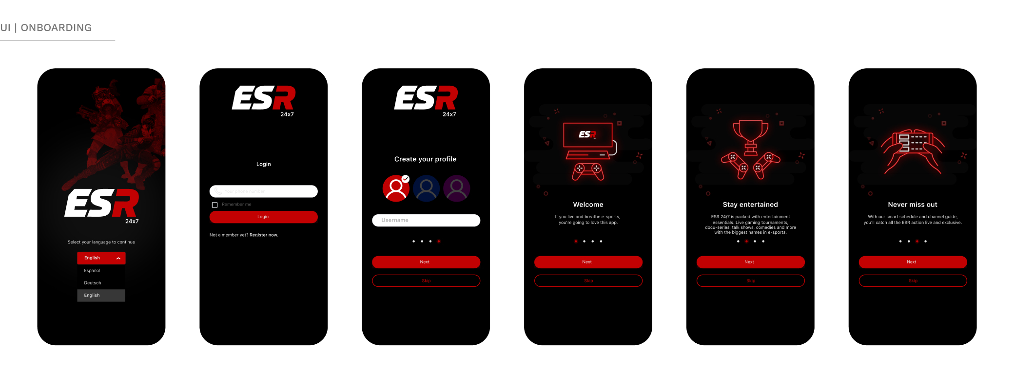
The visual design phase focused on creating an appealing and immersive interface. The chosen colour scheme incorporated bold and energetic colours, reflecting the excitement of e-sports. There had been some basic branding guidelines to follow, however, ESR had given us a lot of scope for creativity. Engaging visuals were strategically placed to capture users' attention. Attention was also given to typography selection, ensuring legibility and style consistency throughout the application.
Hand off and development
In this project, I also was the front-end developer. This made the design hand off very simple. Working alongside a back-end developer, we created solid ways of working across timezones (He in the US, me in the UAE) for our little team. It was fortunate to be able to do this, being able to ensure the design was pixel-perfect along every stage of development, making QA a doddle.
Impact
Post-launch, the platform received mainly positive feedback, particularly for the live scores feature, which drove significant interaction. After analysing subscribers' behaviour of the MVP product, we identified some areas for improving experience through iterative designs and testing. Retention was one of these areas, we found a significant drop off of subscribers after trial periods and we wanted to mitigate this by giving subscribers ongoing reasons to engage by nuturing them post onboarding.
Next Steps
Looking ahead, our next growth phase involves expanding with a natice App into the USA, where ESR TV has a substantial following, positioning us to capitalise on a ready audience and further accelerate user acquisition.
Reflection
Although this had it's challenges, it was incredibly rewarding to be able to play such a major part in shaping this product. This project was a success in driving growth and engagement, though, in retrospect, there are areas where different approaches might have yielded even better results. Personally, this project was a significant learning experience, deepening my expertise in both e-sports and the technical aspects of front-end development and product design. Managing a project of this scope and ensuring pixel-perfect implementation was highly rewarding, especially given the impact it had on user acquisition and overall platform success.