Abandon Cart campaign
This case study follows the journey of the design of the company's Abandon Cart email campaign.
Project Overview
The Abandoned Cart Campaign is a critical aspect of Kathmandu's marketing strategy, aimed at recovering potential sales lost during the checkout process. Thorough research and analysis of user behaviour and shopping patterns within Kathmandu’s e-commerce website and usability tests, we gain insights into the pain points and motivations of customers who abandon their carts. This research formed the foundation for the redesign, ensuring a user-centric approach to addressing the challenges. Our design goals were to help create a streamlined checkout experience, offering Kathmandu’s customers less friction by removing any unnecessary steps that may lead to cart abandonment.
The Problem
The challenges faced in crafting a visually appealing and responsive design that seamlessly guides users back to their abandoned items. Our research found that guest users were 82.11% more likely to abandon their cart with a high abandon rate as the week progressed. A key observation was that users are more committed to purchase online at the start of the week, and they are the least committed on the weekend. This could be because customers on the weekend are researching items online before heading in-store. Common themes such as Waiting for items to go on sale, Cost Anxiety and completing the transaction in-store were seen to be a recurring issue.
Goals
- Defining an email remarketing campaign strategy for abandoned cart shoppers.
- See a decline in cart abandoment from the ecomm website.
- Uplift in customer interaction.
- Develop personalisation framework inc. measurement approach Develop high level roadmap of activity and capability uplift.
My Role
UI/UX Design
Research
Journey Mapping
UI Design
Front-end Development
Tools
Figma
Miro
Confluence
Azure DevOps
Salesforce Marketing Cloud
Timeline
Overall: 4 weeks
Process
User Stories User Flows
Wireframes
HiFis
Dev Handover
Front-end Development
Testing
Reflections
Research
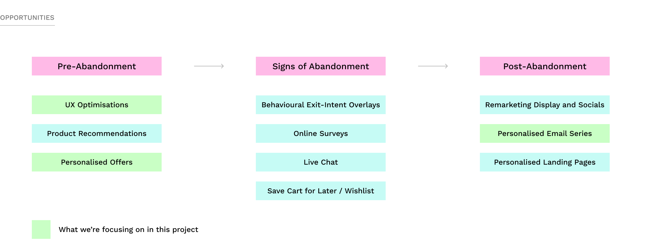
For this project, there was a small team put together of CX Design, 2 UX/UI Designers, Copywriter, Project Manager, BA and Developer. To kick off, we wanted to understand and synthesise current state to uncover key challenges and opportunities. Assess current capability to execute personalisation across channels. Initial research indictated the below opportunities for mitigating cart abandonment at certain stages of the process. To kick off this project, we wanted to focus on UX optimisations and an email campaign personalised to the customer.
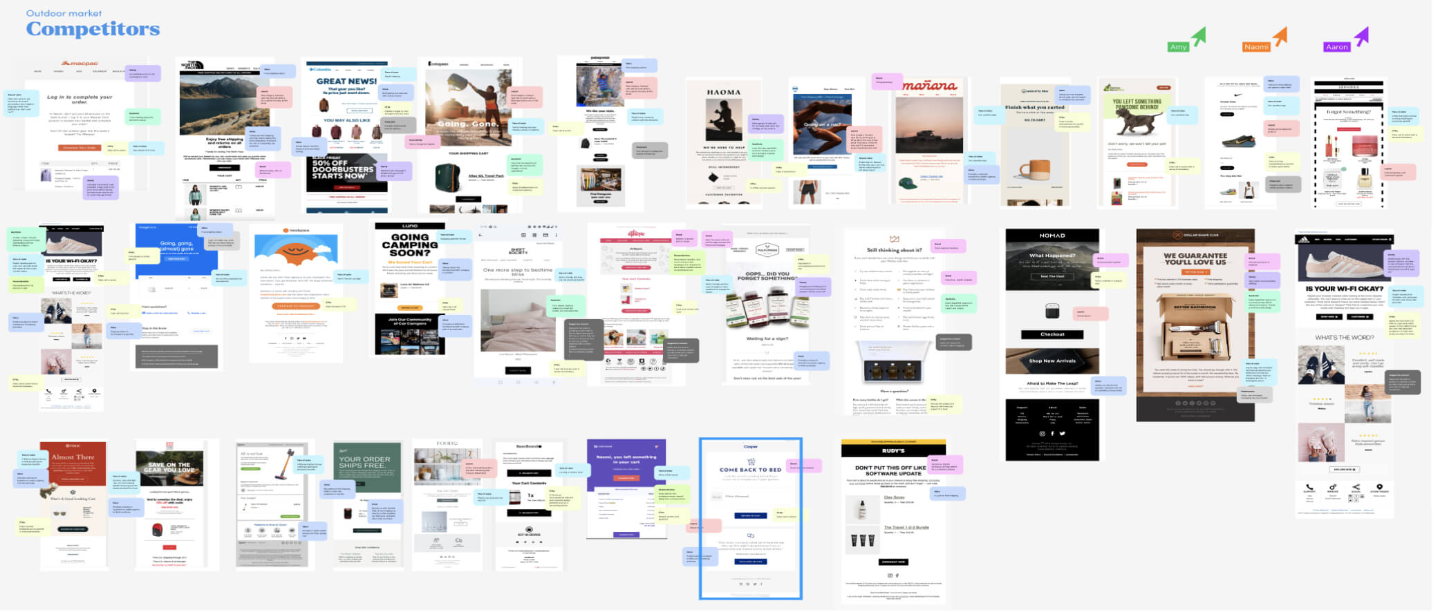
Competitor Analysis
Taking these learnings on board and looking at what our direct competitors and best in practice are currently doing really helped to define the path of what Kathmandu should strive for.
Ideation
Develop and prioritise executional ideas (use cases) Develop high level tech, data and process requirements. Cart Abandonment should be thought of as a series of interventions across the entire purchase journey - not just post abandonment campaign, we needed to look at the whole process, not just focus on the end of the customers journey. However, having said this, we started with a minimum valuable product by reimagining the Abandon Cart email campaign.
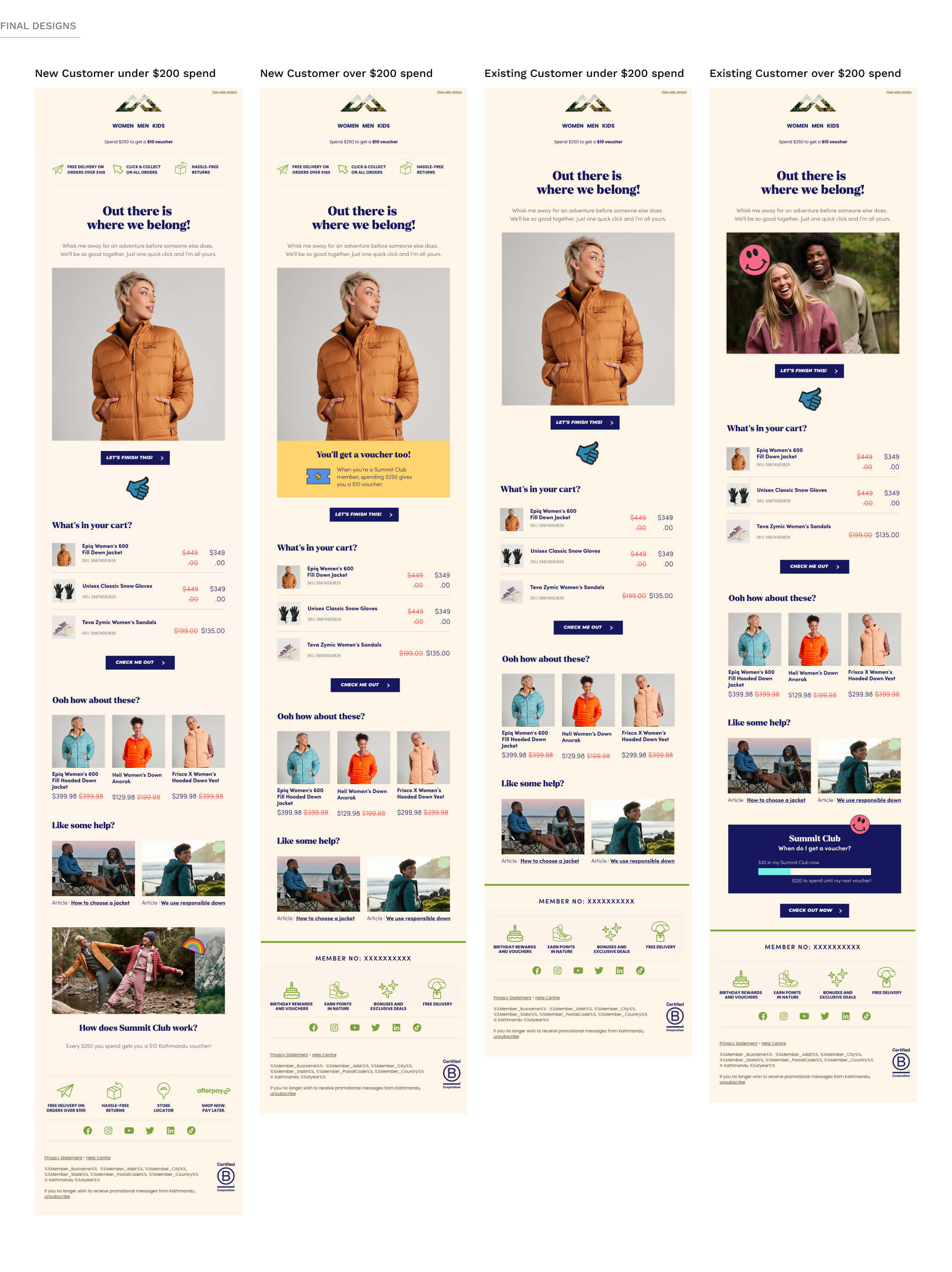
We decided on running 2 segments, one for New customers and one for existing customers and running this project as an A/B test with a control and a personalised offer. To new customers, we wanted to educate them that if they spent $250, they would get a $10 voucher to spend. Existing customers would be well aware of this mechanism so for them, we decided we would want to show them their points progress and how far they were from reaching their next voucher, helping the customer to know their benefits.
Design
Wireframes
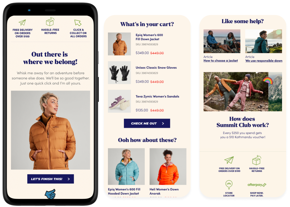
From here, we could develop wireframes, sculpting out a structure and adding a layer of personalisation not seen in previous campaigns. We wanted to cut through the clutter of your inbox, leading with striking imagery and copy, personalise to make as relevant as possible to the customer, with the use of clear CTAs and leveraging supporting content to inspire, inform and reduce overall friction.
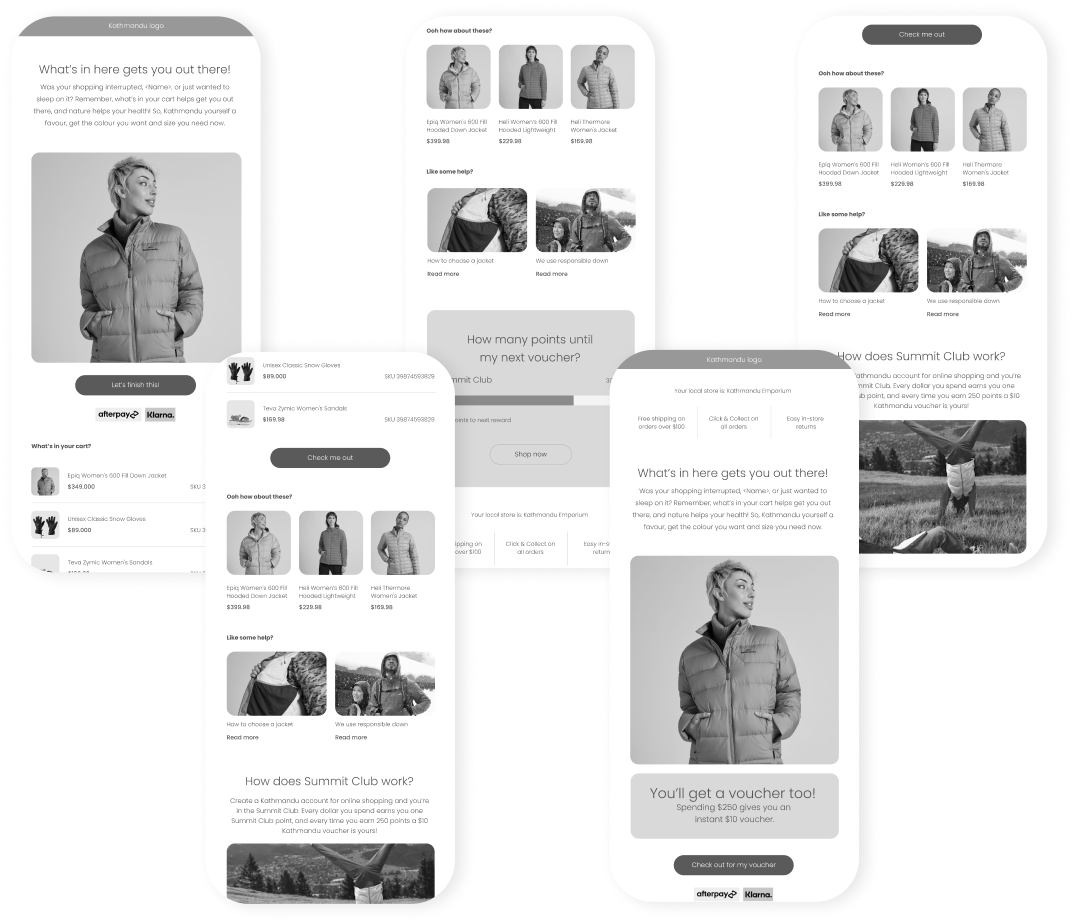
UI Design
The visual design is simple and focused, heroing the abandoned product to avoid overwhelming the customer with a myriad of choices.
Impact
Since launching this new campaign there has been an increase in open rates from 50.64 % - 68.6% in Australia (56.59 % - 61.4% in New Zealand) month on month compared with the previous campaign, with a rise (3% on average in both countries month on month) in completed transactions from abandonment. With further optimisations planned for the future, this is a promising start.
Reflection
This project was a great opportunity to delve into the shopping mindset of a customer. To be honest, I learnt a lot about my shopping habits while researching this project. The team worked well together, and we established a great routine throughout the project. One of the greatest challenges we faced was at the last hurdle in the development phase. While intergrating personalised offers into Salesforce Marketing Cloud, we ran into many issues and had to delay the project by an extra 2 weeks to fix the bugs. This is when I stepped in to lend a hand as a front-end developer. Overall, the data speaks for itself and the campaign did show an increase in purchases post abandoment.