Out There Rewards
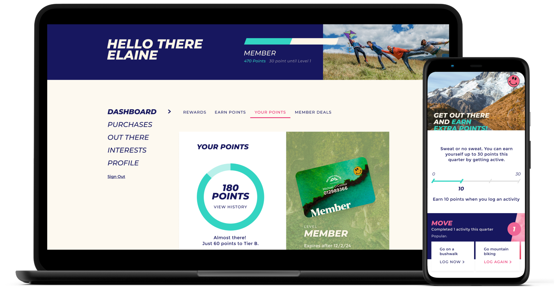
This case study explores the transformation of Kathmandu's loyalty program Summit Club into the Out There Rewards, from its initial concept and proposition to the creation of an interactive online member hub and subsequent branding and advertising.
Project Overview
Kathmandu is the leading outdoor fashion retailer in Australia and New Zealand. In 1987, the brand launches along with it’s loyalty rewards program Summit Club. This loyalty program focused on a transactional approach of a spend and save model only rewarding customers for spending. In 2021, Kathmandu went through a major rebrand, repositioning themselves to no longer be the ‘top of the mountain’ hardcore adventure brand, but the fun-loving, out there ‘outside makes us happy inside’ brand, focusing on the positive impact that nature has on us. However, the original loyalty program had been left behind, still advocating the outdated brand proposition.
To address this, a new loyalty program was born. Out There Rewards.
The Problem
When this project started, no development, UX, or UI design had been done, only a small amount of research into the program and ways in which engagement could be enhanced. We knew we needed to move away from the current branding of the program to match the new brand proposition. They needed the UX designer (AKA me) to craft this concept from the ground up, creating a responsive web application (desktop and mobile), making sure the interactions and flows are seamless, intuitive, and visually pleasing.
Although the initial research had indicted that moving to a tiered program would be beneficial , no features or exploration of what should be included had been architected as yet.vThe focus of the product would be providing an engaging online member hub where customers could earn points and feel rewarded.
Goals
- Drive acquisition and gain new members who connect with the brand
- Customer retention
- Improve customer experience across all touch-points
- Bring UI up to date
- New ways to reward customers that aren’t just spend
My Role
UI/UX Design
Research
Journey Mapping
UI Design
Tools
Figma
Miro
Confluence
Azure DevOps
Adobe After Effects
Timeline
Overall: 9 months
Process
User Stories User Flows
Wireframes
HiFis
Style Guide
Dev Handover
Testing
Reflections
Research
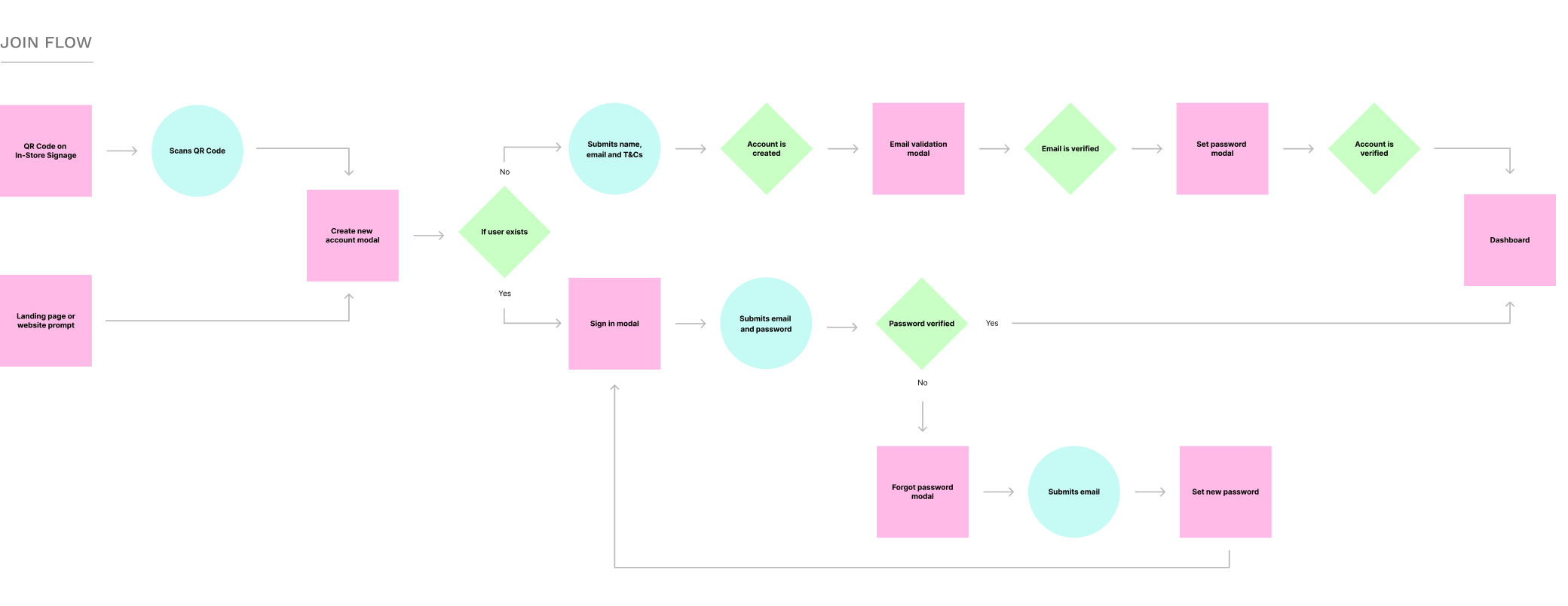
We identified from our research that the onboarding process caused a lot of friction, especially surfacing a major problem where by when a customer signs up in-store, they would have to sign up online again in order to make their online account, a huge problem. We wanted to look at these frictions, and find a great solution so our customers could enjoy a much better onboarding experience. Developing new flows, for both in-store, from QR codes around the stores and online, adding an extra layer of security by introducing two factor authentication. We foresaw that this could have an uplift of upto 36% in acquisition of new members in our online hub.
Design Crit
The original Summit Club’s member hub had been quite basic, consisting of only a couple of features, like account settings and an image of your member card. The design had been unimaginative to say the least, pure function and did not give the customer any reason to engage. We knew we could radically change this to be somewhere our customers could interact with us and create an emotive connection with Kathmandu.
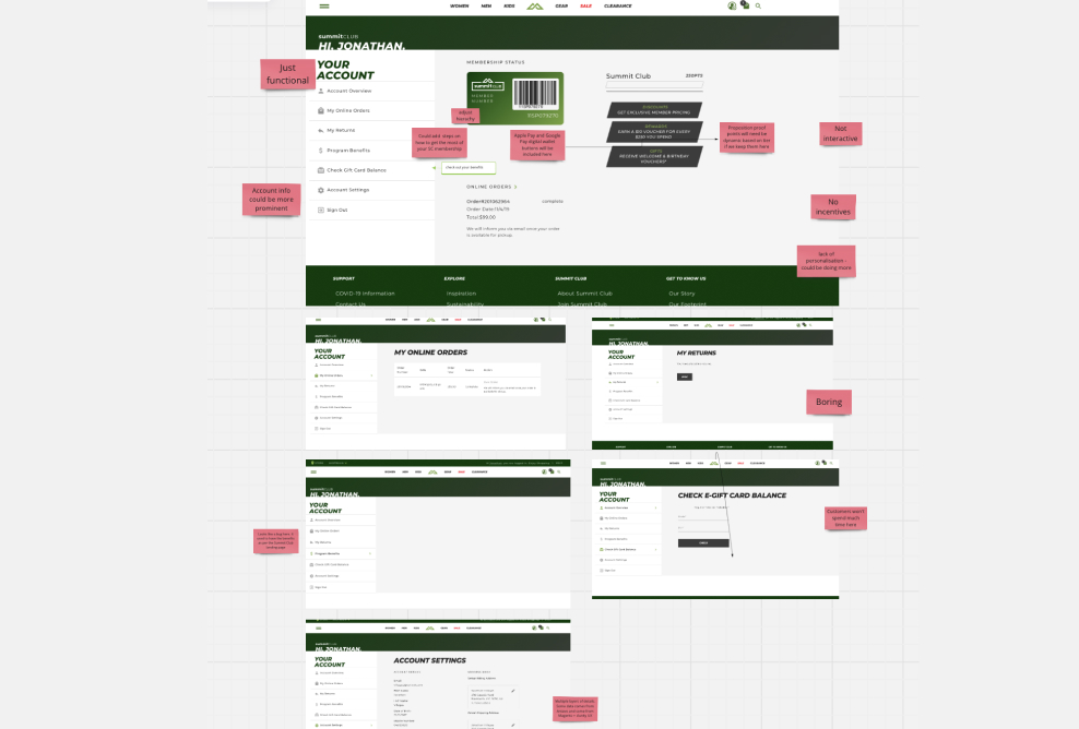
Competitor Analysis
Always a fun part of the research phase, finding and analysing best in practice loyalty programs. Seeing how different brands approached rewarding their customers was interesting.For example, beauty brand Mecca stood out to me, how they gifted customers in their different tiers with a Beauty Loop box of goodies at certain times throughout the year. This seemed to empathise a level of experience that many other brands didn’t do well.
The team took many great takeaways from this process as well as some things to avoid. We could see that including different ways for customers to earn points would be beneficial and a seamless onboarding journey would be crucial
The Customer
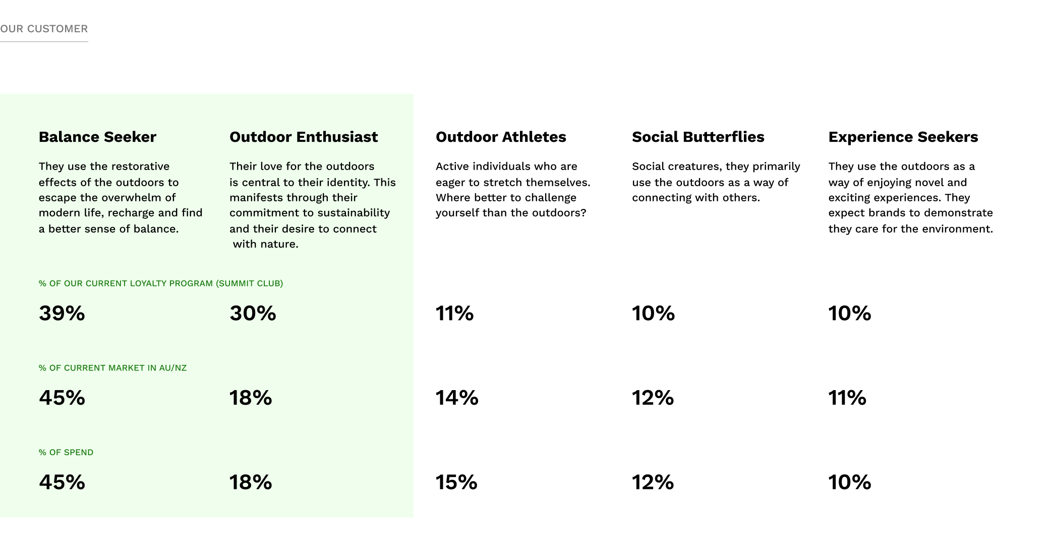
We identified 5 segments of customers with 2 for us to focus on based on opportunity, our brand and business strategy. The Balance Seeker and the Outdoor Enthusiast.
Ideation
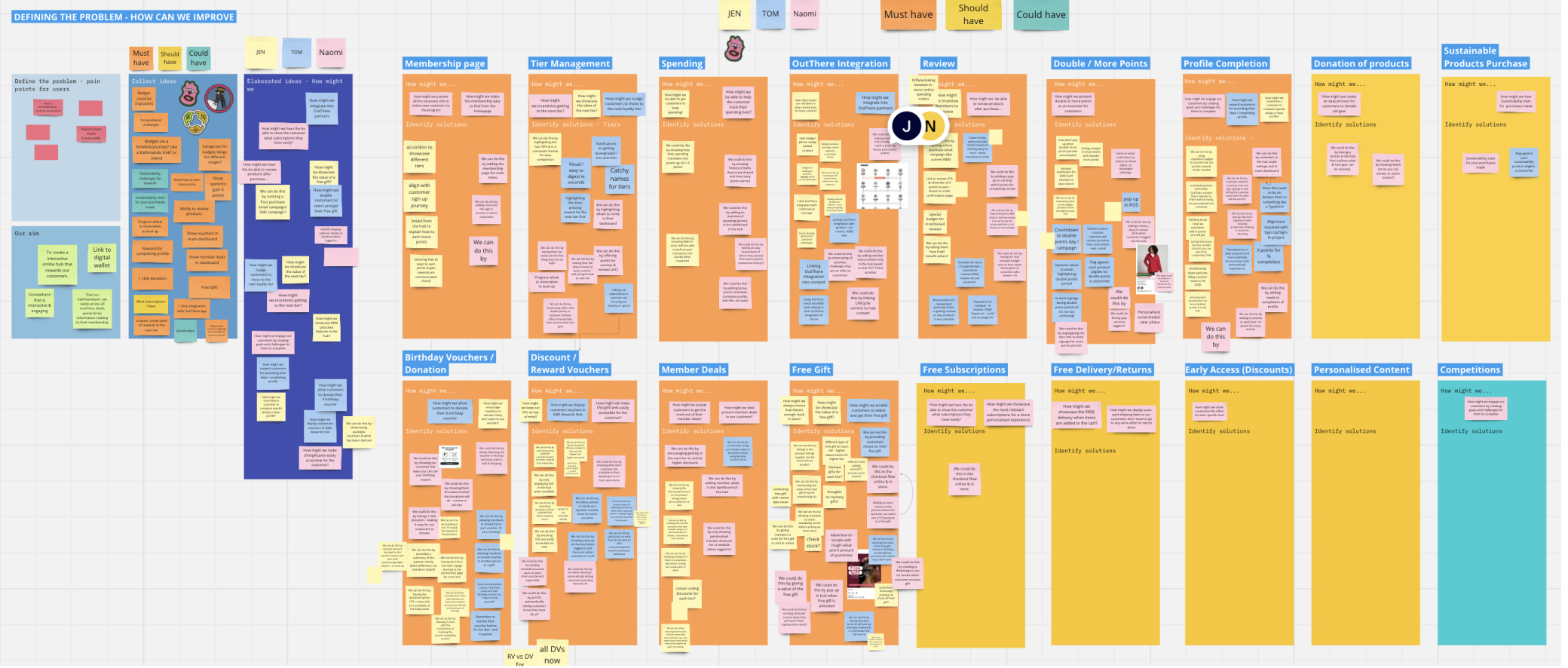
Taking into the challenge we had in front of us, I started off the project by mapping out the information architecture of the website hub and worked with the team to change the layout of information in a way that is intuitive.
We came up with a number of ideas, including tier levels, challenges, surprise gifts for higher levels to receive throughout the year and partnering with other brands like AllTrails, Strava or Fitbit to offer deals or memberships were all ideas that could enhance a members experience.
User Stories
User stories most vital to the MVP were submitted to the project manager. These involved some of the basic functions of the application. Further development would be built on the foundation we set.
- As a customer, I want to be able to sign up easily either online or in a store. No more waiting in queues for staff to help me.
- As a customer, I want to be able to personalise my profile such as personal information, delivery addresses and login details.
- As a customer, I want to be given a comprehensive overview of what benefits & rewards I’ll receive.
- As a customer, I want view a full history of what i’ve previously purchased and their status.
User Flows
With the established user stories as a guide, the team developed the user flows by initially working individually, and later presenting and iterating on them in group sessions. The objective was to deliver on each user story in the most streamlined and intuitive manner possible. One of the largest priorities we knew we wanted to focus on was onboarding, this had been a big point of friction in the previous program both from experience and systems side. Establishing a coherent journey that a customer can join from either an online or in-store environment was an important step for joining what had previously been siloed flows.
Design
Wireframes
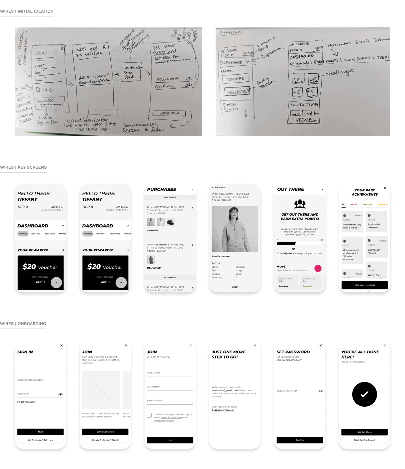
Since this application was a responsive design, we designed screens for mobile first before starting on the desktop version. Working alongside another freelance UX designer, we split the users flows up and I set up work sessions with this designer to talk through design patterns and explore which ones ultimately served our customer best. We explored several iterations for each flow and presented them back to the project team to ensure that we aligned.
UI Design
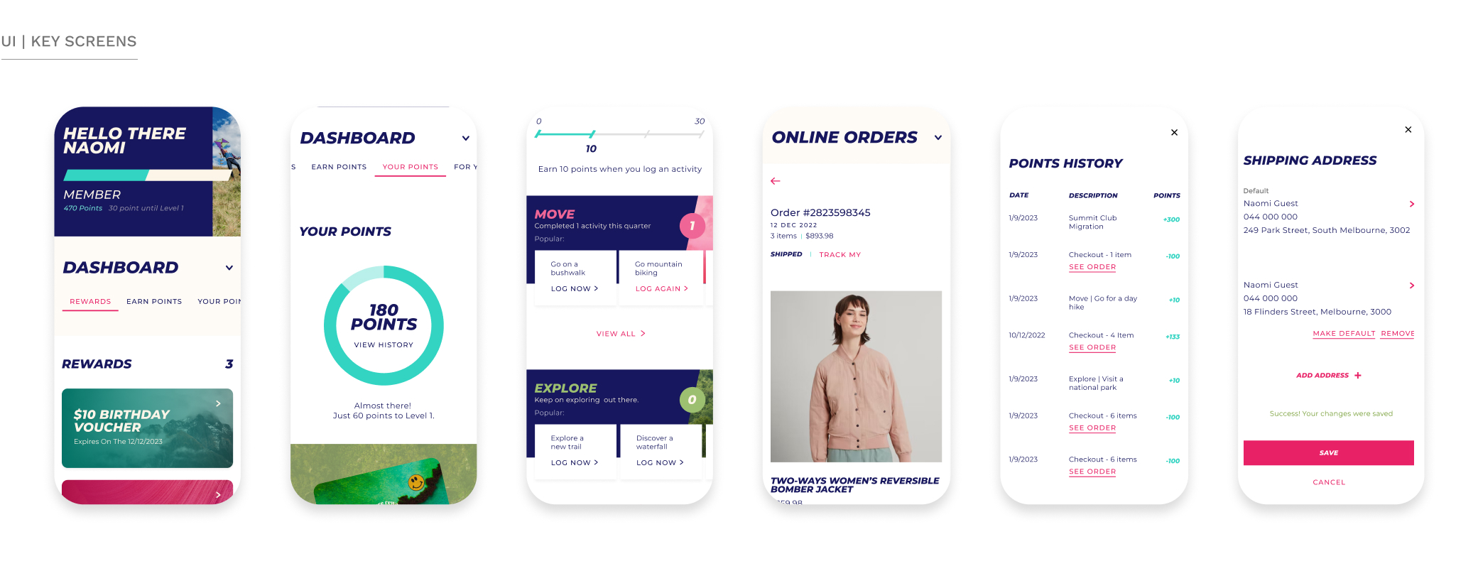
Developing a look and feel that stays true to our overarching brand, while also having a clear identity for itself. Special Group Australia was brought in to look at the logo design and set some initial parameters and colour palette, but from then on out, I led the UI for the members hub, leading a small team of freelance designers. I wanted to create something joyous, light and introduce elements and textures of nature, after all, we’re encouraging our customers to live their best life outdoors.
Iterations
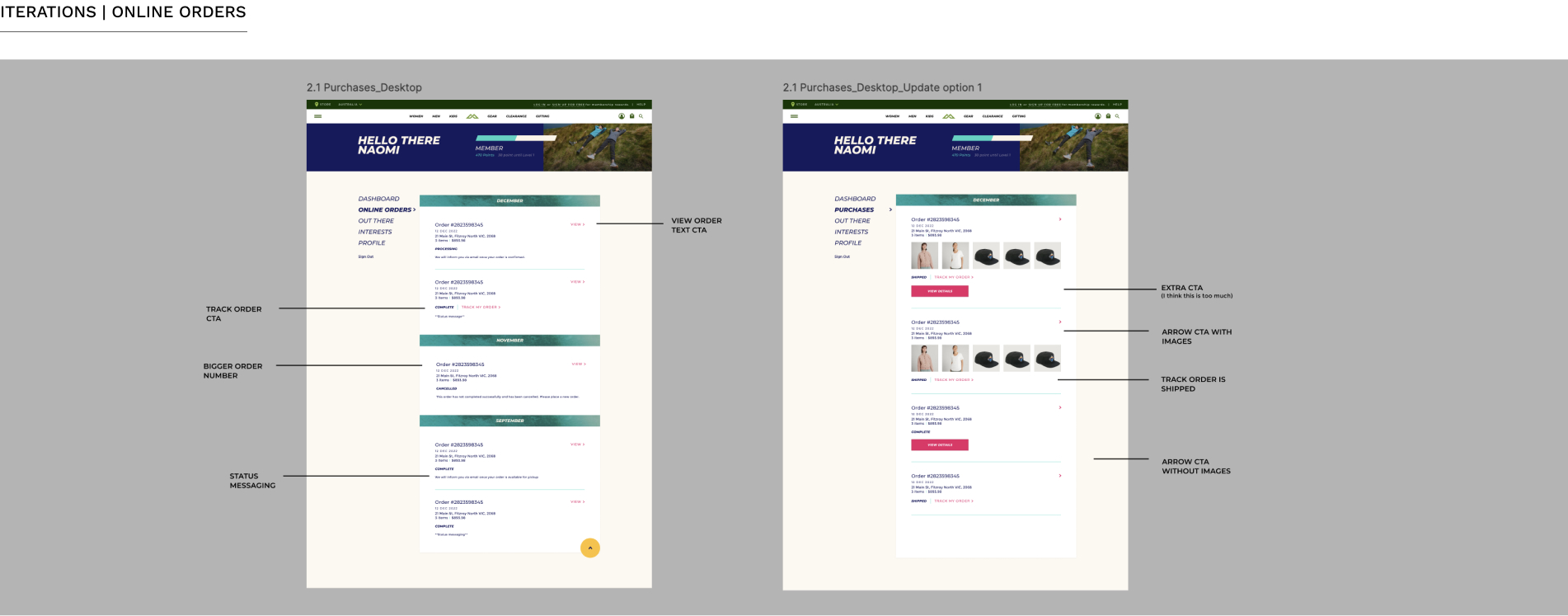
I find that taking a measured iterative approach to design is key to being able to measure it’s performance. I love this. As the project evolved, we learned many things and we took these learnings and enhanced the designs. Working alongside the customer services & e-commerce teams we looked at making enhancements to the current purchases flow. Initially, the business had wanted to incorporate both online & in-store purchases within the members hub, however the cost of getting the backend technology at point of sale to connect seamlessly lead to this feature being dropped and the Purchases section being dubbed Online Orders. Ultimately, the team opted for a much cleaner first option, removing product images to relieve any potential future licensing issues.
Impact
- 1.9% increase in acquisition
- New members accounted for an increased $310.3M year to date.
- Member Contribution is up +2.8%
- Average transaction value (ATV) is up +2.3% year on year.
- Vouchers led to an additional $655,000 AUD in revenue.
Next Steps
A point of friction we noticed through analysing overall engagement, was the uptake in using reward vouchers in our e-commerce site. We wanted to help make this a lot easier by showing them their available vouchers in their checkout journey. Initial results have shown this to have a positive impact on the experience while shopping online. This is just one of many ideas that are in the works for the next phase of Out There Rewards.
While we have shown a noticeable increase since the launch of the new design, the decrease in shop frequency is an area for improvement, however, sales across the industry and economic struggles in the ANZ market have seen a reduction across all retailers. By prioritising customers' needs, while balancing business objectives and metrics, we have created a platform that drives customer loyalty and fosters a deeper connection between Kathmandu, the outdoors and its customers.
Reflection
Designing the responsive interface for this e-commerce loyalty program was an immensely fulfilling experience for me. For one, it was so great to work end-to-end across multiple teams and touch-points in an area where, when I started this project, I knew very little. Getting to start from scratch, working from insights to define features used by millions of people and most of all encouraging people and my peers to get out in nature, that felt great. We discovered that utilising a dashboard was a very effective way to present the customer with their current tier and points information, achievements, benefits and rewards. We faced many challenges along our journey, unforeseen technical restraints led to last minute design alterations and workarounds. Overall, I’m proud of what we achieved especially for such a small team working across various timezones. The first year of the new program has shown promising outcomes, and I hope it continues to grow.