Mobile Academy
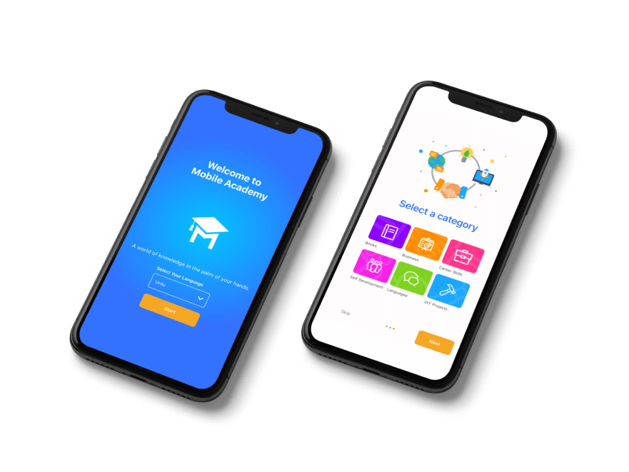
This case study explores the design process of a native iOS e-learning app to be launched in Pakistan.

Project Overview
Mobile Academy is a native iOS and Android e-learning app designed to provide a convenient and engaging learning experience for users across various disciplines. The primary goal was to create a user-friendly interface that would encourage continuous learning and knowledge retention. This case study provides an overview of the design process, challenges faced, and the solutions implemented to create an effective UI/UX for Mobile Academy.
The Problem
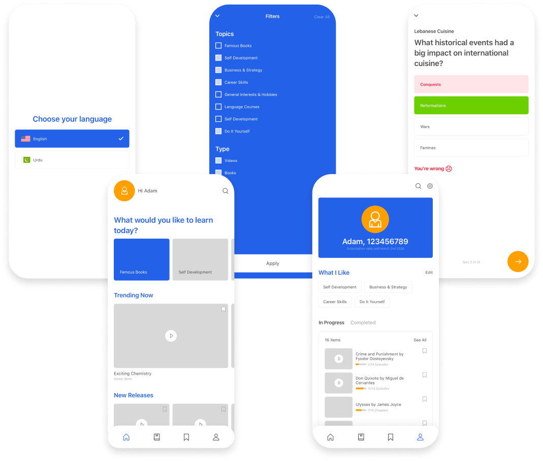
Through research, we found Mobile Academy’s previous web application onboarding was confusing and a big friction point for the user. A challenge we wanted to tackle was creating a seamless onboarding journey, while not compromising on security. Given that the initial launch was to be in Pakistan, creating easily accessible language toggle was a high priority that had previous not been considered. A key feature we wished to expand was personalisation of the product, allowing users to select topics of interest while onboarding meant we could deliver a more personalised app earlier on in the users journey.
Goals
- Interactive environment
- Personalised course content
- Improved onboarding journey for users
My Role
UI/UX Design
Tools
Figma
Miro
Jira
Timeline
Overall: 3 months
Process
User Stories User Flows
Wireframes
HiFis
Research
The project began with extensive research and analysis of the target audience, which consisted of students, professionals, and lifelong learners. User interviews, surveys, and market analysis were conducted to understand their learning preferences, pain points, and expectations from an e-learning platform. The findings formed the foundation for the design approach, ensuring a user-centric interface that catered to their needs.
Ideation
Mobile Academy aimed to make learning interactive and engaging. Interactive elements like quizzes, discussions, and multimedia content were integrated into lessons to enhance user participation and knowledge retention. Gamification elements, such as leaderboards and points, were introduced to create a sense of competition and motivate users to continue learning.
User Stories
We had started the project with a few essential user stories and requirements set by the client. From here, the team did some further development.
- As a learner, I want to be able to personalize my profile such as age, interests and course preferences.
- As a learner, I want an engaging, personalized, and accessible education experience.
- As a learner, I want easy access to resources and support for tracking my progress.
Design
Wireframes
Working along side my design lead, we started the design process. Based on the research findings and design goals, wireframes were created to establish the information architecture and layout of key screens. Low-fidelity prototypes were developed to test the user flow and gather feedback. Iterative improvements were made based on user feedback, ensuring a smooth and intuitive learning experience.

UI Design
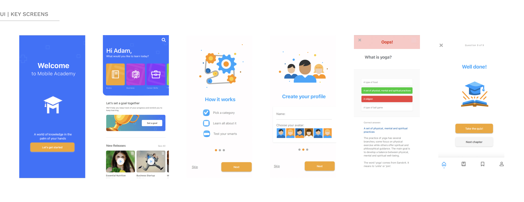
Keeping on brand, but introducing a much needed refresh. A clean and modern design language was adopted, with a harmonious color palette and clear typography to enhance readability. Attention was given to using relevant visuals and illustrations to make the learning content more engaging and accessible.

Reflection
Through user-centered design principles, we have achieved a more intuitive and engaging interface, streamlined navigation, and personalized learning pathways. Key improvements include the implementation of adaptive learning techniques, and a robust feedback system, which have collectively contributed to increased user satisfaction and learning efficacy. Moving forward, ongoing user feedback and analytics will be instrumental in further refining the app.